Olive in Peace sama
ロゴ以前の宿の立ち上げ段階からブランディング部分で参加させていただいている長期プロジェクト。 【お客様の声】 Working with Myna has been the most fulfilling experience we have had since we created our company.
■ロゴ
ロゴ以前の宿の立ち上げ段階からブランディング部分で参加させていただいている長期プロジェクト。
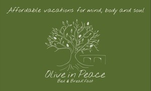
実際に宿の敷地内にある32本のオリーブを葉の数で、五大陸を5つのオリーブの実で表現しました。
色はすべて庭や建物の色から配色を考えました。

■名刺
ロゴを片面に大きく載せ、お客様と一緒に選んだ手書き風の字体をキャッチコピーに使いました。紙は植物の廃材から作ったエコペーパーがいい感じの手触りで、宿にぴったりの雰囲気を作ってくれています。
【お客様の声】
Working with Myna has been the most fulfilling experience we have had since we created our company. She took the time to listen to us, talking about our vision for the company. She was then able to ask us specific questions regarding the logo, such as: words best describing our business, colors we felt best matched its spirit, fonts that represented our style.
With these pieces of information, Myna came up with a series of logos, and this was truly delightful as she included a wide range of options, going from truly funny to conceptual. She insisted that we chose at least two variations, which is remarkable considering that it created more work for her.
The next step was to settle on one option, and from there, we were impressed by her attention to details, and artistic abilities. She advised us at this stage about colors, and produced several renderings with the different fonts.
We eventually received the final designs, which felt like we had done it ourselves: Myna captured what we wanted in a beautiful piece of art. It’s not an exaggeration, as during our last trip to Italy, we found a handmade table runner with a tree very similar to the one she designed, and the man who embroidered it is considered to be one of the best artists of Lecce (Puglia)!
We are happy to talk directly with you about Myna’s work.
Contact us at:
www.facebook.com/oliveinpeaceBB/

